Pixels and Politics
So last month, just before the elections, I was thinking about electoral shifts. With everyone pretty much convinced that the Democrats were about to take over Congress, or at least the House, I saw a lot of people making comparisons to the 1994 Republican takeover of Congress, and I saw one person make the claim that the 1994 Republican takeover wasn’t really that big of a shift compared to previous Congressional swings earlier in American history.
This made me curious. I started to wonder how one might go about judging such a thing, and started to realize that although detailed histories of the U.S. presidency abound, there really is not very much well-organized information out there about the historical makeup of the Congress.
I decided to solve this the way I solve most problems in my life: by making animated GIFs. I downloaded the rosters of the first through 109th congresses from the Congressional Biographical Directory, and then a month later, when things had settled down a bit, added the information from Wikipedia’s tentative listing of the newly-elected 110th congress. Then I wrote some perl to convert the Congressional rosters to graphs, with one colored pixel marking the party which held each seat in each of the 110 elected congresses. You can find the results below.
For starters, here’s just one big graph of everything, sorted from top to bottom by state, with senate and house seats separated. As with any of the images in this post, if you want to see it closer, you can click to zoom in:
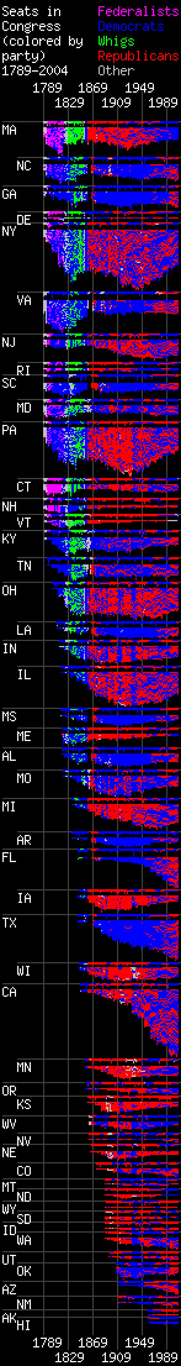
Although this graph is to some extent cryptic since it doesn’t tell us exactly why any of these pixels change colors with time, if you look closely you can actually see many of the important events of American history reflected quite visibly in this graph. For the most obvious example, the rise and fall of the Federalist and Whig parties are clearly visible in the early part of the graph as big blobs of purple and green, accompanied by a wave of gray pixels around the 1820s, just before the Whigs appeared, marking the collapse of the Democratic Republicans before the party was reborn under Andrew Jackson. A solid line of gray pixels is also visible at the beginning of the graph, marking those heady few early years of American politics before any political parties existed at all. The Civil War is clearly visible as a long vertical black streak cutting through the graph around 1860, marking the period when the southern states simply didn’t participate in the Congress. After the Civil War most of the southern states turn very briefly red, then blue again, as blacks suddenly gained the right to vote, then lost it again with the rise of Jim Crow and the Ku Klux Klan. After this point the “solid south” phenomenon becomes incredibly marked, with the northern states in the graph a patchwork of red and blue pixels, but the southern states a solid sea of blue for a hundred years as a result of post-Reconstruction animosity toward the Republicans. In the decades after the 1950s, the great northern/southern swap as the Democratic and Republican parties in many was reversed themselves is visible as a great gradual blur of colors swapping, followed by a solid wall of change around 1994– Massachusetts and Texas are almost mirrors of one another in this period, with Massachusetts slowly turning from nearly solid red to solid blue, and Texas doing the same in reverse.
When we look at the graph by states this way, of course, shifts in Congressional control— which is more of a numbers game– are not so clear. Some of the big shifts are visible– for example stripes of red and blue are clearly visible around the beginning of the 1900s, as first the Republicans sweep congress during the Spanish-American War, then the Democrats sweep congress during the Great Depression and WWII. The 1994 Republican Revolution is visible in some states, but not others– and in those places where it does occur, it seems less like a solid switch than just an acceleration of the steady progression from blue to red in many places of the country that followed Nixon’s “southern strategy”, and the steady emergence of the “red state” phenomenon. The 2006 elections– the last column of pixels on the right– is barely visible at all.
The shifts become a little more clearly visible if we choose not to sort by state:
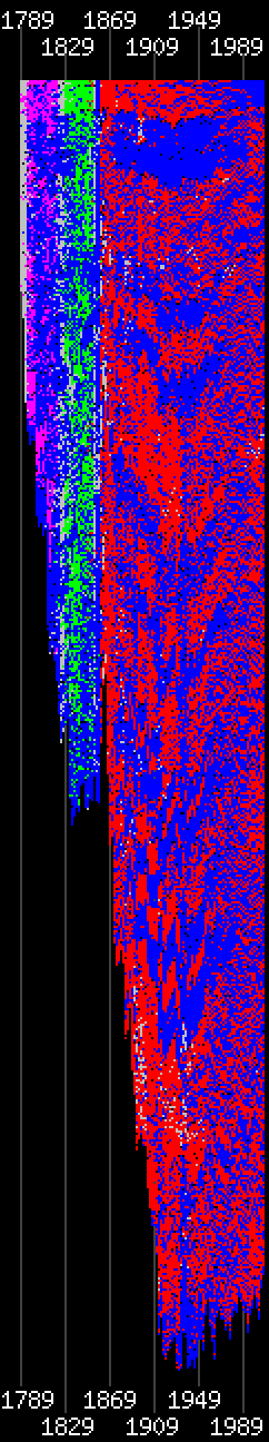
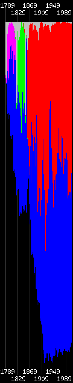
In the graph on the left here, sorting still occurs by state, but rather than being separated neatly the states are all just mashed together. This graph is a little hard to make sense of. More clear is the graph on the right, where pixels are instead sorted by party. Here the shifts in congressional control are quite blatant; very brief swings in power, like the Democratic powergrabs following the Mexican-American war and the Watergate scandal, become easier to see, and it’s easier to see which numeric swings were lasting and which weren’t. The “Republican Revolution” is a lot more visible on this graph than on any other, and at the very end of the graph, someone familiar with the politics of the last decade can almost chart the rise and fall of the Republican congressional majority pixel by pixel: Republican control spikes like crazy in 1994; then drops off just a little bit as voters become disillusioned with the Republicans in the aftermath of the impeachment circus; voters then warm toward the Republicans again in one final one-pixel spike, representing the halo effect of Bush’s 2004 campaign; then suddenly the numbers swing toward the Democrats again in that last final rightmost pixel.
One thing that stands out to me in this particular graph is that though the swing towards the Democrats in 2006 is quite pronounced, it’s certainly not nearly as pronounced as the swing that put the Republicans in power in 1994. Although the Democrats still hold a decent majority, and it looks like they’re about on par with where they were at what looks like the beginning of the Reagan revolution, they don’t hold nearly as much power as most of the historical Democratic majorities since FDR have. Although there are other reasons besides pure numbers to think that in this particular election the voters meant to send a message– although it’s not really visible in any of the graphs above, one of the interesting facts about the 2006 elections is that no congressional seats or governorships held by the Democrats went to the Republicans on 2006, only the other way around– in terms of pure numbers the 2006 elections were not really that big of a shift, and the Democrats are only really halfway to replicating the feat that the Republicans pulled off in the 90s. If nothing else, this means that the Democrats are going to have to govern carefully to keep control of the situation with their relatively thin majority– and will have to really convince the voters they’re doing something worthwhile with that majority from day one, because it will not take much to lose it all in 2008.
These graphs aren’t perfect. The chief problem with them is that they aren’t exactly sorted by seat. The data that I’m working off of here doesn’t show who serves in which district, only who served in what state. This means that if someone holds a particular congressional seat for 20 years, they’ll show up on the graph as a solid line of 10 horizontal pixels– but their replacement for that same seat won’t necessarily be in the exact same horizontal position as they were. Also, I don’t have records of who won the elections– Congress’s listings only showed who served during each two-year period, so if more than one Congressperson occupied the same seat during some period (for example, because one of them died and was replaced with the second), both show up in the graph. (This is why, although each state only has two Senators, many of the “Senate” lines in the by-state graph at the top are occasionally taller than two pixels.)
What I’d be curious about doing with these graphs in future is getting hold of some more specific data concerning who served in exactly which Congressional district, so the graphs can more accurately reflect the shifts within states– for example, so that if most of a state votes one way, but there’s one specific city or region that consistently votes another, it would be clearly visible. It also might be interesting, with that information in hand, to try to rework some of these graphs as colored maps, although I’ve never found a good way of making maps in software. Another interesting possibility might be implementing some sort of mouseover feature, so that by moving the cursor over any particular pixel you can see the name of the person that pixel represents.
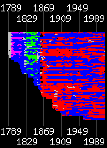
The other thing that I’d like to try to fix about these graphs, though I’m less sure how is that they’re kind of a lot to take in all at once– they’re too tall to fit on a computer monitor, and without zooming in a lot of the features are hard to make out. This is a little bit helped on the graph that I think is my favorite, since it serves very well as a kind of “summary”– the graph where House reps are ignored and only the Senate is displayed. On this graph we get a good general idea of how people are voting but the graph is still small enough to take in at a glance, so the nature of the big party shifts by region and event are most “obvious”:
If anyone has any other suggestions for ways that these graphs could possibly be improved, I’d be curious to hear them.
As one final bonus, here’s an animated graph, with columns of pixels from left to right representing states: